• 2 min read
Coca-Cola’s new look draws Marlboro comparisons
Coca-Cola rolled out a subtle brand refresh, but the reaction focused on one thing: many viewers say the new typography resembles Marlboro.
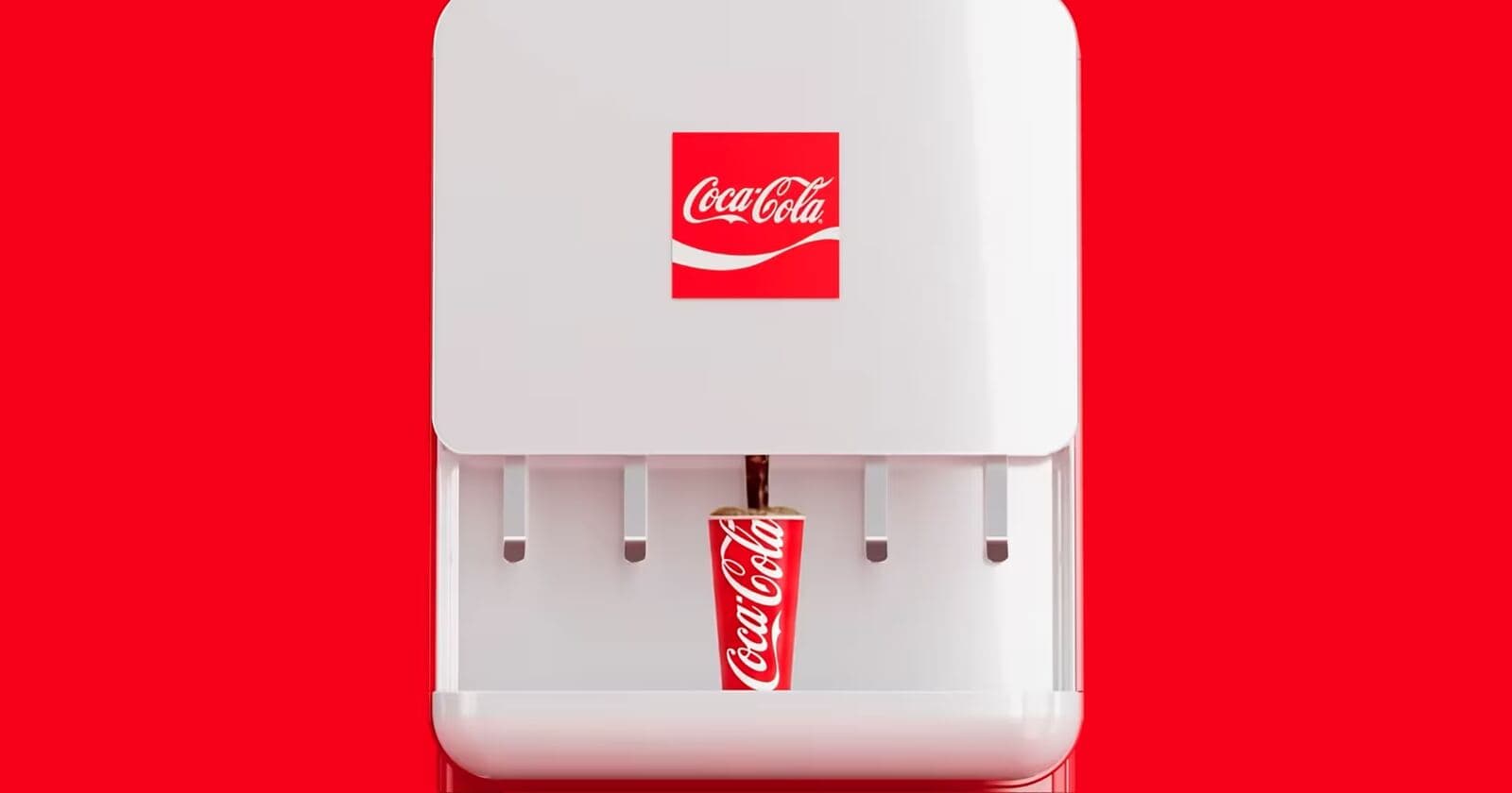
Image: ITzine
Coca-Cola has unveiled a subtle refresh of its brand identity alongside a 90-second video, but the redesign is being overshadowed by comparisons to Marlboro. On social media, users on X and several designers said the updated logo graphics now resemble tobacco packaging more than the company likely intended.
Designer Andreas Storm wrote that the new look is not literally Marlboro, but that the visual similarity is too obvious to ignore. Coca-Cola, for its part, describes the changes as a “visual refresh” meant to make the brand “clearer and more consistent” across every audience touchpoint. In a published statement, global brand leader Arnab Roy said the company is building on already familiar elements to create a stronger foundation for growth.
The Marlboro association is especially awkward because of what the tobacco brand represents. In public health, tobacco has long become a near-template for a toxic category. Cigarettes were promoted for decades in film, on television, and through sponsorships before public attitudes shifted sharply. In the US, adult smoking fell from about 42% in 1965 to 11% in 2022, according to the American Lung Association.
Recommended reading
LEGO Gives Bondi Blue iMac G3 a Second Look
That shift pushed tobacco companies to distance themselves from their own products. The parent company of Philip Morris was renamed Altria Group as part of that effort. For consumer brands, the lesson is straightforward: once a product category is widely seen as harmful, even indirect visual cues can work against you.
That is also why this matters for Coca-Cola beyond graphic design. Restrictions on advertising sugary sodas have been debated for years, and schools and public spaces are increasingly tightening rules around those drinks. Against that backdrop, even an accidental resemblance to Marlboro reads as a bad signal for a company that has spent decades selling not just a beverage, but a lifestyle.
Coca-Cola hardly lacks brand recognition. But that level of visibility means any tweak to its identity is instantly measured against other cultural symbols, and Marlboro may be the worst possible comparison.

Design & UX Editor
Yuki believes that a great product is defined by how it feels. She critiques software interfaces, hardware ergonomics, and the philosophy of design in tech. With a background in industrial design, she analyzes the subtle decisions that make tools intuitive or infuriating. She advocates for accessible, human-centric technology.
via ITzine