• 2 min read
Pixel Weather widget gets padding tweaks as Google Clock gains colorful icons
Google has quietly refined its Pixel Weather widget and refreshed the Google Clock app with a splash of color. The Pixel Weather update introduces subtle layout adjustments that add more padding to the forecast widget, c
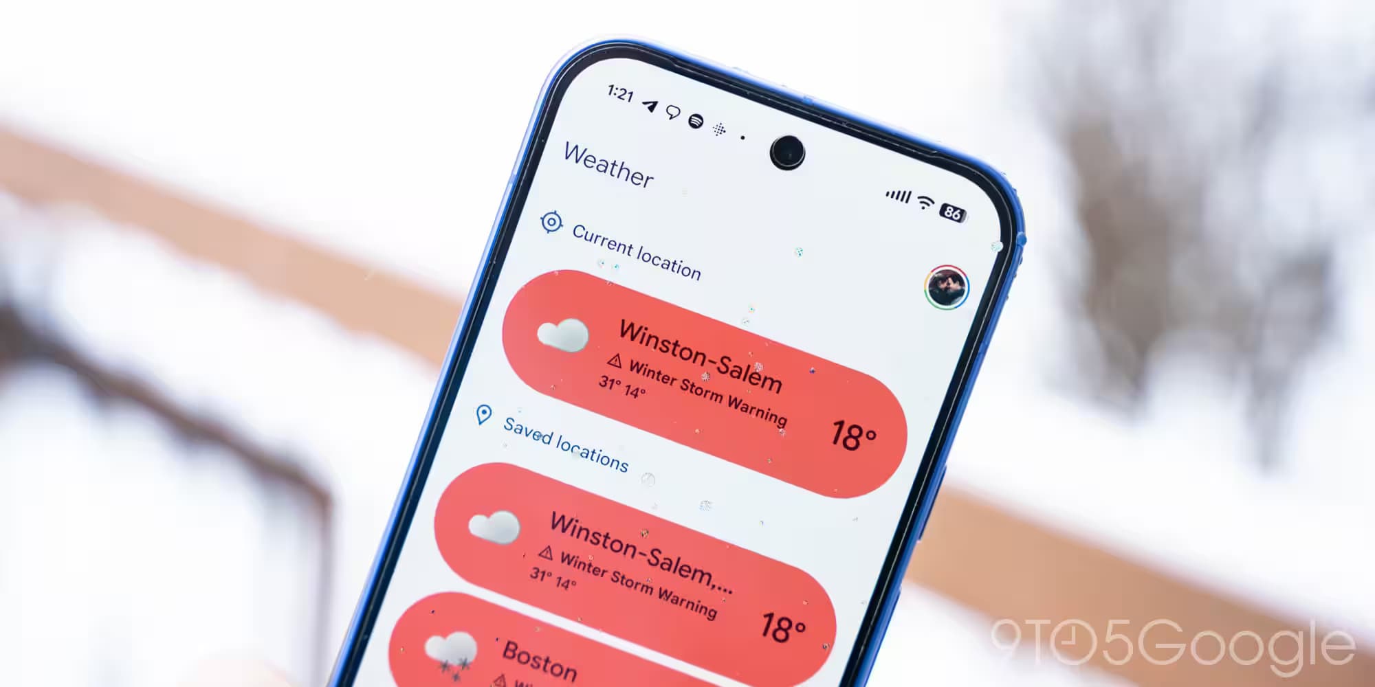
Image: 9to5Google
Google has quietly refined its Pixel Weather widget and refreshed the Google Clock app with a splash of color. The Pixel Weather update introduces subtle layout adjustments that add more padding to the forecast widget, changing how many days' forecasts are visible depending on the widget size. Meanwhile, the Google Clock app moves away from its previous monochrome world clock icons, now sporting colorful new designs that were first seen in Pixel Weather.
In the latest Pixel Weather update, version 1.2.20251230.x, the 5×3 widget size no longer displays tomorrow’s forecast line, and increasing the size to 5×4 or 5×5 shows fewer days than before – two instead of three, and four instead of five, respectively. This change isn’t about cutting information but improving the widget’s spacing to fix visual bugs and create a cleaner look. Users with different device display settings might notice this adjustment most.
Simultaneously, Google Clock’s version 8.6 embraces the colorful iconography introduced by Pixel Weather, retiring the world clock’s monotone icons that have been standard since version 7.14 last June. This update gives the app a more vibrant feel with better visual cues to differentiate time zones at a glance. The update is rolling out gradually through the Play Store, but the weather integration remains exclusive to Pixel phones.
Alongside these cosmetic updates, Google also pushed a minor update to Google Calculator with version 9.1, which appears to have no outward changes but keeps the app up to date.
Recommended reading
Sam Altman ridicules Anthropic ad as backlash grows
The Pixel Weather tweaks demonstrate Google’s effort to polish its native apps, prioritizing clarity and user experience. Meanwhile, bringing Pixel Weather’s colorful icons to Google Clock hints at a broader push to unify Google’s design language across its apps.

AI Editor
Ava covers the rapidly evolving world of artificial intelligence, from foundational models and research labs to the real-world economics of intelligence. With a background in computational linguistics, she cuts through the hype to find out what actually works. She firmly believes that benchmarks are just marketing until reproduced in the wild.
via 9to5Google