• 2 min read
Gemini Temporary Chat gets a new icon on mobile
Google appears to have quietly swapped the Gemini app’s Temporary Chat icon on mobile, and the new version looks less like an incognito cue and more like a design experiment that escaped the lab. The change shows up serv
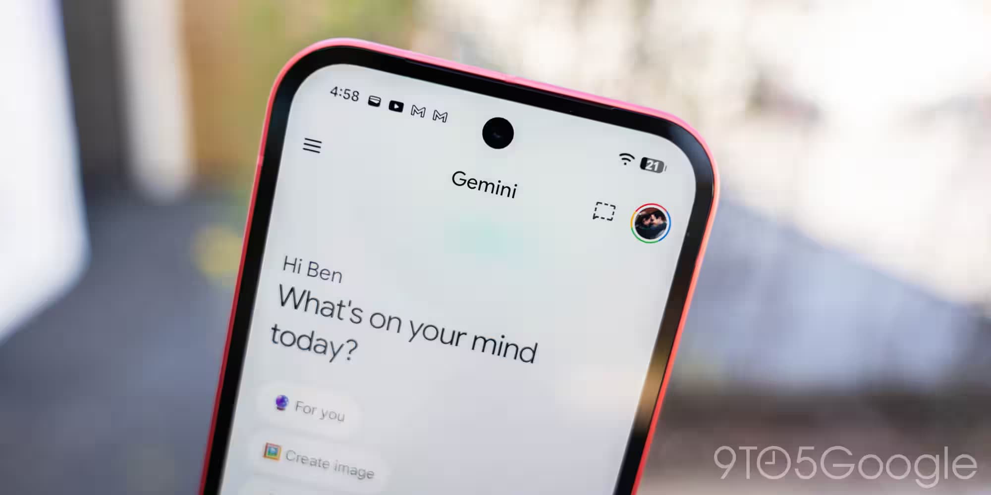
Google appears to have quietly swapped the Gemini app’s Temporary Chat icon on mobile, and the new version looks less like an incognito cue and more like a design experiment that escaped the lab. The change shows up server-side, sits in the top-right corner of a new chat, and replaces the familiar dotted chat bubble with a rounded oval-and-pencil mark.
Temporary Chat still behaves like Gemini’s privacy-lite mode for one-off conversations, so the feature itself is unchanged. What has changed is the visual shorthand, and that matters more than it sounds: in AI apps, icons are not decoration, they are the interface’s memory aid. Google’s old dotted badge was blunt but instantly readable; the new one is cleaner, but also easier to miss if you are moving quickly.
Gemini Temporary Chat icon changes on mobile
The rest of the Gemini app looks unchanged. Notebooks are still in the sidebar, the overall UI is intact, and only the mobile app seems to be affected. That points to one of two familiar Google behaviors: a cautious test or a bug wearing a product-team badge.
Google has a long habit of polishing surfaces before explaining them, and AI products are especially prone to this sort of live reshuffling. Competitors are doing the same thing in different ways: OpenAI keeps refining ChatGPT’s conversation modes, while Microsoft and others keep nudging Copilot toward a more app-like, less tool-like feel. In that company, Gemini’s new icon fits the broader trend – even if the old one was better at doing the one job icons are supposed to do.
Why the old Temporary Chat icon worked better
The previous dotted chat symbol had a blunt advantage: it telegraphed “temporary” at a glance. The replacement is softer and more in line with Gemini’s rounded interface elements, but that aesthetic match comes at a cost in clarity. If you’re racing to start a private conversation, “visually consistent” is a nice design note; “obvious” is better.

Recommended reading
Hassabis says STEM makes you 10x better at AI
For now, there’s no official explanation and no sign of a broader redesign. If this is a test, Google may be measuring whether users tolerate a subtler icon. If it is a bug, then someone on the Gemini team has probably already heard about it. Either way, the next question is whether this version sticks – or quietly disappears the next time the app refreshes itself.

AI Editor
Ava covers the rapidly evolving world of artificial intelligence, from foundational models and research labs to the real-world economics of intelligence. With a background in computational linguistics, she cuts through the hype to find out what actually works. She firmly believes that benchmarks are just marketing until reproduced in the wild.